Spinning up a website for a vinyl collecting expo.
How I used four pages to create a stylish and effective event website.

Bash Events is an events-hosting company. Their new vinyl record-collecting expo, DIG, was in need of an online presence to help generate interest and ticket sales. Bash Events commissioned me to design a four-page website for the event that was visually striking, informative, and easily navigable. I was responsible for building the site from the ground-up and presenting it to internal stakeholders.
Problem and Goals
With DIG being not only a new event but also taking place at a large venue with a relatively niche target audience, Bash Events was looking for a Web site that would grab prospective attendees' attention, hold it, and ultimately entice them to purchase a ticket. With only four pages to work with, the site needed to quickly convey essential info such as pricing, vendors, and parking, while also not overwhelming the user with said info.
I was given free rein to determine the look and feel of the site. Since this is an event centered around the vinyl record, I was hoping to create a warm, vintage vibe, while also adhering to modern design and usability standards. I also wanted to incorporate some novelty into some of the interactive elements, with the hope that it would make for a memorable experience and a positive first impression for event-goers.
Users and Audience
Bash Events provided two personas to help drive and inform my decision making for the site.
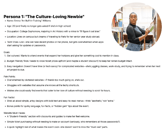
The first persona was "Emma," who represents the younger, more culture-curious demographic that Bash was looking to attract to DIG. Emma wants to go to events that expand her horizons and perceives as cool; however, as a 20 year old college student majoring in Art History, money is a factor and she needs to be able to quickly discern cost before deciding to attend or not. Her tech fluency isn't the strongest, so she values simple, easy to understand designs. With her art background, though, aesthetics are also important to her when visiting a website.
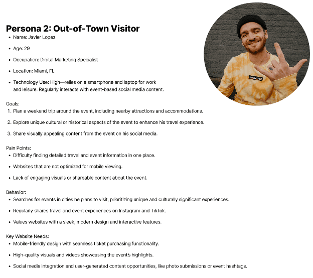
The other persona, "Javier," represents the tourist crowd that Bash was also hoping to get to attend DIG. He would be traveling from out of town for the event, and planning his entire weekend around it. Javier is a digital marketing specialist, so he's pretty savvy when it comes to using various tech platforms. He values websites that are well optimized for mobile, as well as high quality visuals and interactive elements.
Initial Development
Moodboard
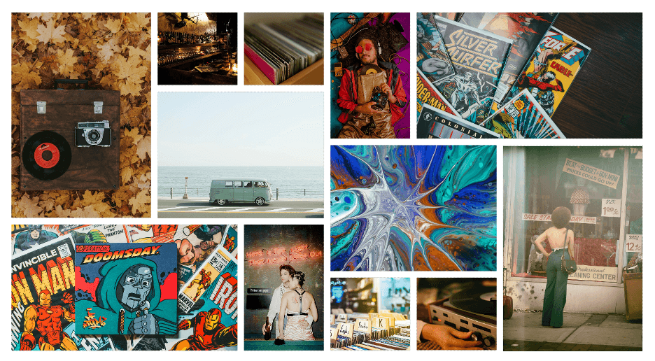
DIG’s primary focus is record hunting and collecting. With that in mind, I knew that even though vinyl has had a pretty big resurgence in recent years, most record vendors at the event would likely have a more vintage inventory up for grabs. This fact heavily influenced the development of the mood board, which would then visually inform the direction of the site.
Site Map
I also needed to determine the information architecture of the site. Four pages is not a lot to work with, so making sure that each page had a clearly defined purpose and relevant content was critical. Obviously the home page would have to be one of the four, so for the other three, I divided them into “About,” which would give some basic background about the event and the vendors; “Plan Your Visit,” a page centered around parking, event accessibility, and nearby lodging; and finally, “Buy Tickets,” which would show ticket tiers, pricing, and event schedule.
Wireframing
When it came time to build the layouts of each page, considerations needed to be given for both desktop and mobile devices. With mobile, putting everything in a single-column grid layout made the most sense to me; trying to convey all of the event info in multiple columns on a single screen would have been a nightmare, and needing users scroll down as they read isn’t really an issue.
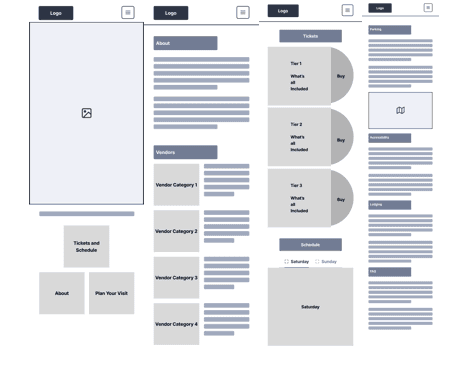
The desktop layout lent itself to having more room to play, given the additional screen real estate vs. mobile. I still stuck to a grid, but instead opted for two-to-three columns within each page. This helped with effective chunking, without dividing the content so much that it became hard to follow.
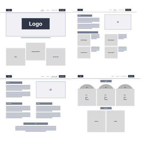
Across both sets of layouts, I needed to make sure that the pages had room for what I considered to be the standout feature of the design—the record sleeves. It would serve as a call-to-action, and on desktop specifically, when hovering over it, a record would pop out of the sleeve. I admit, the idea is more form than function, but I thought it would be something memorable for site visitors.
Designs
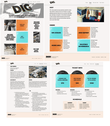
When it came time to move the actual content into the wireframes, it became clear that some tweaks needed to be made. On the desktop version, the home page required the most adjustment. The original layout, paired with the way the pop-out design of the record sleeve was designed, made the page feel too cluttered. Iinstead of having the 3 record sleeves in a staggered position, it ended up making more sense to place them in a simple, vertical stack.
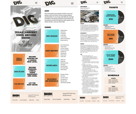
On mobile, I ended up sacrificing the animation of the record sleeve, since hover states don’t really make much sense on the platform. Even without that, the home page ended up getting tweaked in a similar way to the desktop version, this time for the sake of readability. With that change, I had to come up with a different way of conveying to the user that they could interact with it, so I opted for the tried-and-true underline.
Preliminary Feedback and Next Steps
Upon presenting the design, feedback was largely positive. Everyone was pleased with the overall visual direction and were really impressed by the interactive vinyl record. Moving forward, the next phase will be user testing to make sure that the site is easy enough to navigate and that information is ordered logically.
Reflecting on the design, I’m happy with my work; that being said, I do think that the “Plan Your Visit” page could use some more iteration. It is very text heavy, and while I think I did a decent job of chunking out the blocks, there could definitely be additional optimizations made, such as nesting the FAQ’s in an accordion, or having anchor links to jump to specific sections of the page.